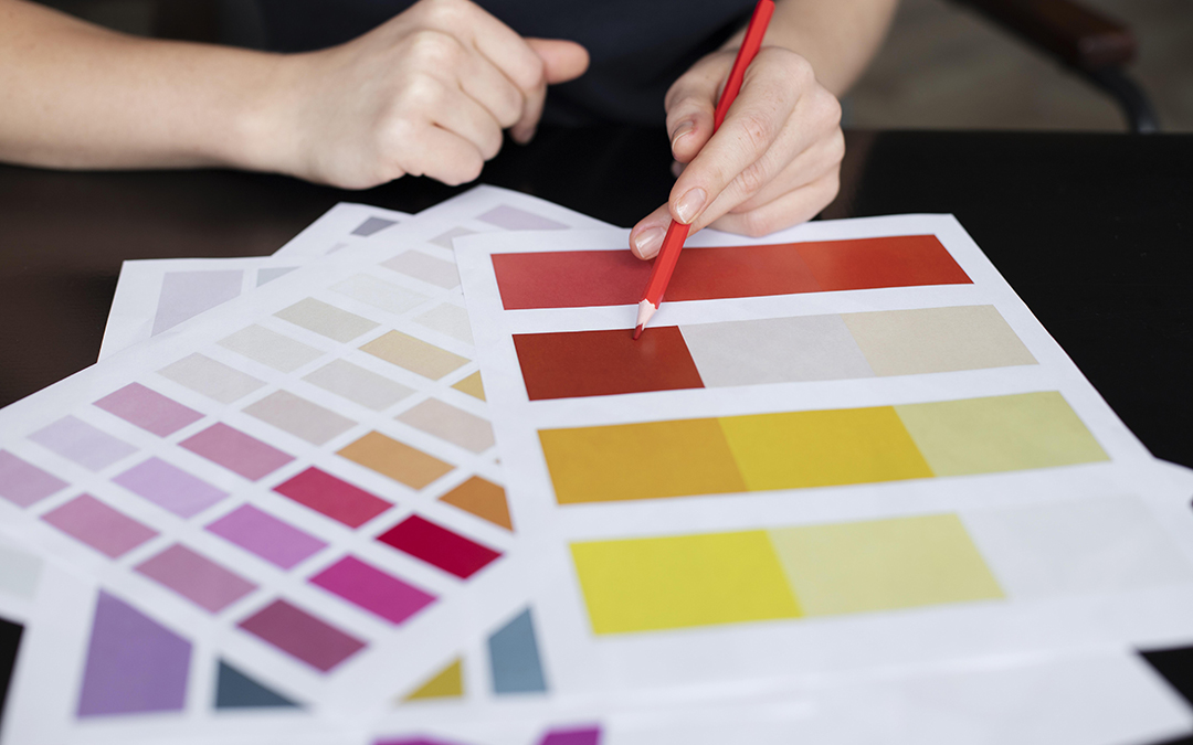
Each Pantone color is assigned a unique code that eliminates the ambiguity of subjective color descriptions like “dark blue” or “forest green.” Instead of guessing, printers and designers can reference the same standardized color swatch to ensure consistency, whether the label is printed today or six months from now.
Matching Pantone colors is particularly important for maintaining brand identity. Consumers associate brands with specific color cues, and even subtle shifts can affect how trustworthy or premium a product appears. Inconsistent colors across labels, packaging, or marketing materials can dilute a brand’s impact and confuse customers.
High-quality label printing involves more than just selecting a Pantone color. It also requires adjusting ink formulas for different materials, ensuring color calibration on press equipment, and performing spot checks during production. The goal is simple but critical: to make sure your product looks exactly the way it’s supposed to… every time.
Want your brand colors to always look sharp, no matter the label type or print run? Pantone matching is the secret to flawless, professional presentation.Contact us today to learn how precise color matching can elevate your labels and keep your brand looking consistent across every product line.